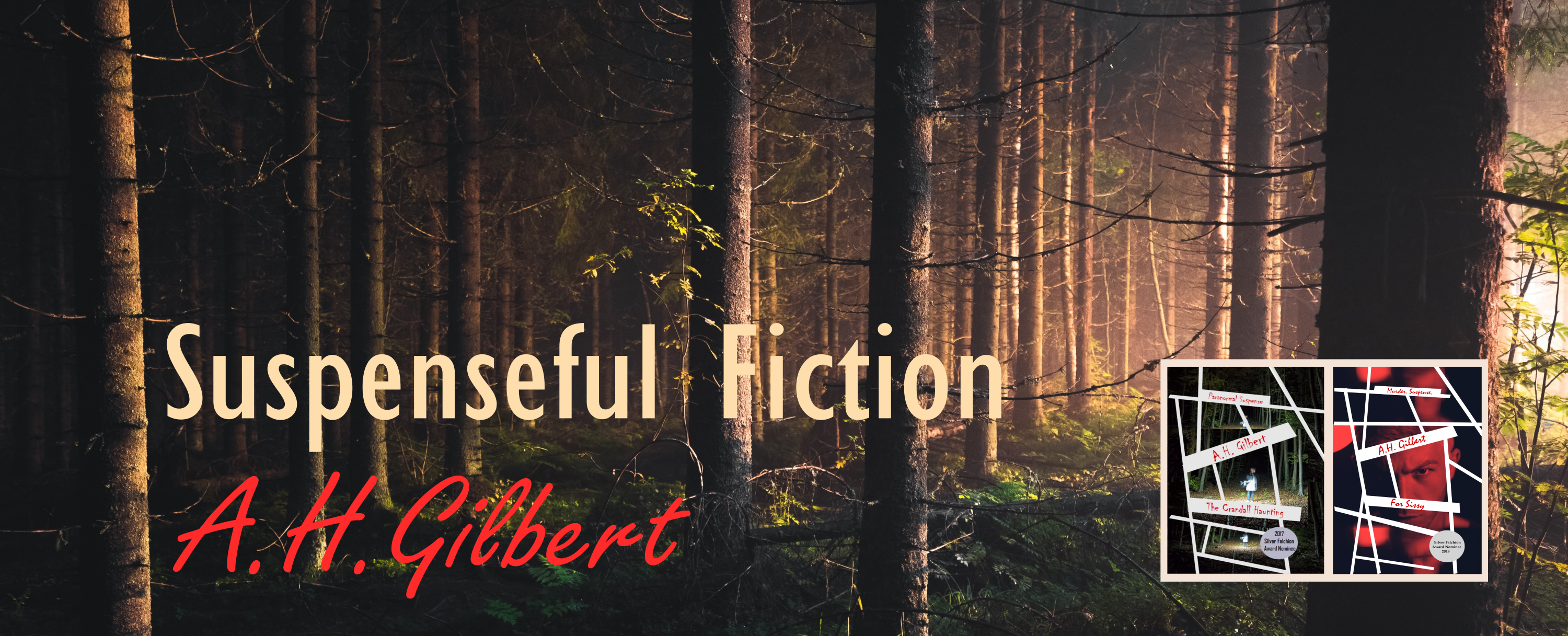
A book’s cover is hugely important. It helps establish the book’s identity at a glance, and then becomes the face of a familiar friend as a reader dives in the pages and gets to know its characters and secrets. I went through many looks and feels before striking just the right design with the scary hand holding an important pink diamond. This design has the right level of creepiness, and still accurately hints at what the reader will find within the pages.
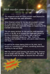

Believe it or not, my own mother was the hand model for this photo, which I snapped with a cellphone at her dining room table. She patiently allowed me to paint her hand a grayish white, then highlight it with dark gray and blue-green pastels before posing her with the gemstone. We also experimented with several throw rugs as background, but there was no question which one looked best when I saw the photos later, on my laptop.
As for the back cover, you might not realize that it shows a cemetery. My husband shot the graveyard photo. What you can’t see is the “dead” white arm creeping around the base of one of the grave stones. That arm was mine, and it was an early experiment with scary arms and hands. You might see another one of the graveyard shots on a cover in the future!
Have a look at the video that accompanies this post. It gives you a quick look at the many, various and sometimes whacked-out designs I played with, before finally getting it right with the current cover. And check out my cover model. Isn’t she great? What a good sport!
Recent Comments